Nate Hoyos
Graphic and Web Designer.
About
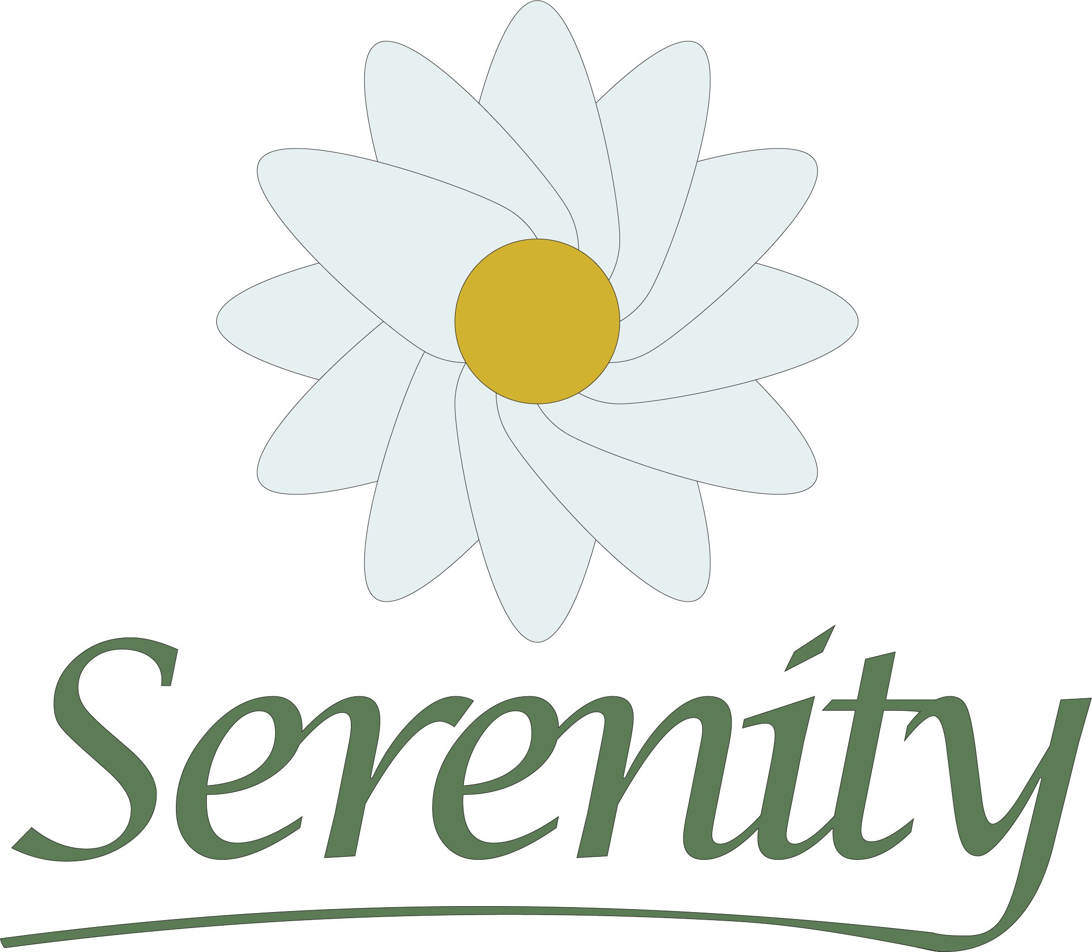
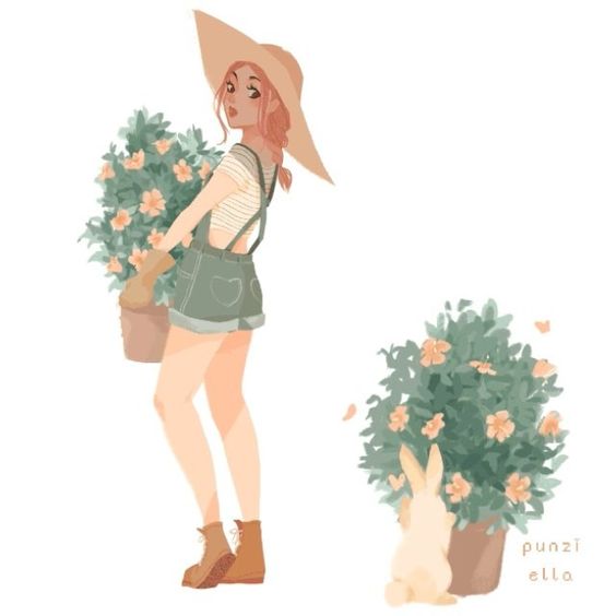
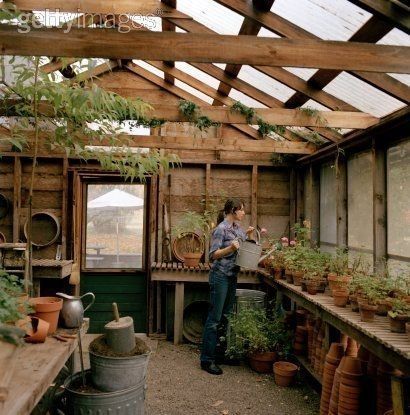
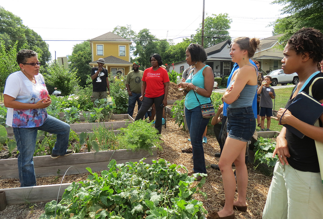
Serenity is a community gardening and greenhouse. Serenity is known for having having rare tropical plants and provides community services that grows more tropical plants to help build garden spots that are more tranquil. The focus on tropical plants also helps grow the presence of endangered plant species.
Research
Serenity was inspired by two main ideas: There are only a few gardening businesses with tropical nurseries and Helping communities can help protect the earth from pollution.
Sketches
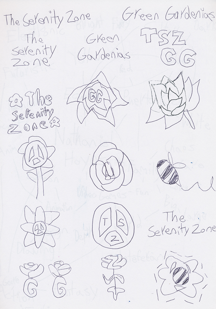
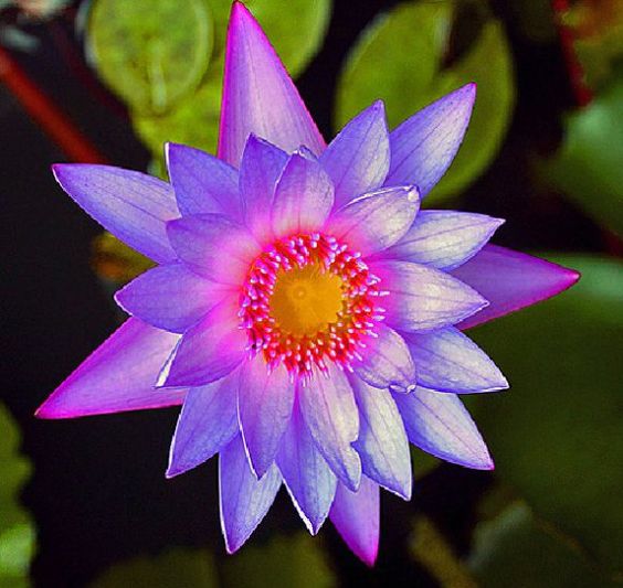
These are a few concept for the Serenity logo. The major aspects that I want to go for a flower, peace, and a garden theme for the logo. The name was originally going to be Green Gardienias, or The Serenity Zone, but I've shortened it to Serenity at to represent all of the key elements that I was aiming for: Peace, Community Gardening, and a Tropical Twist.
Brand Standards
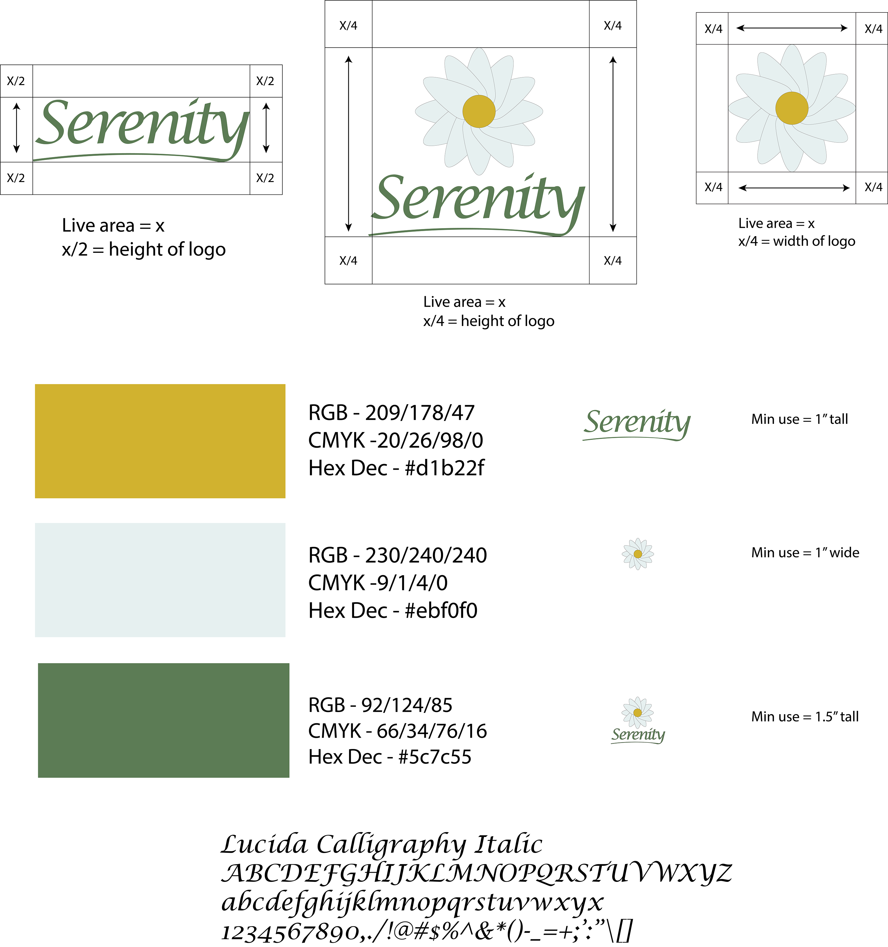
The Serenity logo was very successful. The primiary font for Serenity is Lucida Calligraphy since it has a flowery and peaceful flow. The main colors that are used for Serenity represent not only garden and flowers, but calm and peace as well.
Website
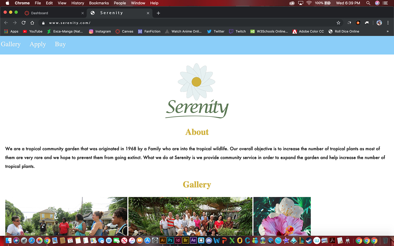
Since Serenity is a community-based project, I made a microsite so communities could easily access the information on the site. Although the Serenity site is small, it packs a punch of information about the tropical plant movement. I also felt it was important to add online access to tropical plants available from the Serenity nursery.