
Nate Hoyos
Graphic and Web Designer.
About

Smoke Daddy is a barbecue joint that doubles as a party venue where friends and families can enjoy various summer activities like sports and picnics. Smoke Daddy is known for using different type of smokes and seasonings to have multiple flavor options for the meats they smoke.
Research
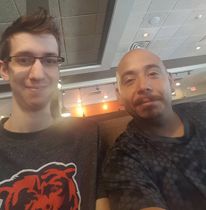
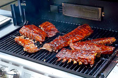
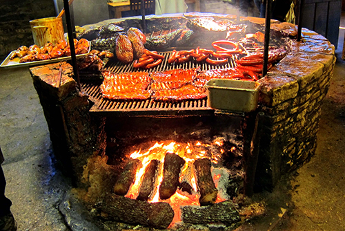
Smoke Daddy was inspired by two main ideas: The first inspiration came from my father because he's a fan of sports and I enjoy whenever he barbecues for the family. The second inspiration came from the different methods to smoke meat in different ways, giving it a nostalgic taste that most fathers create when they're grilling.
Sketches
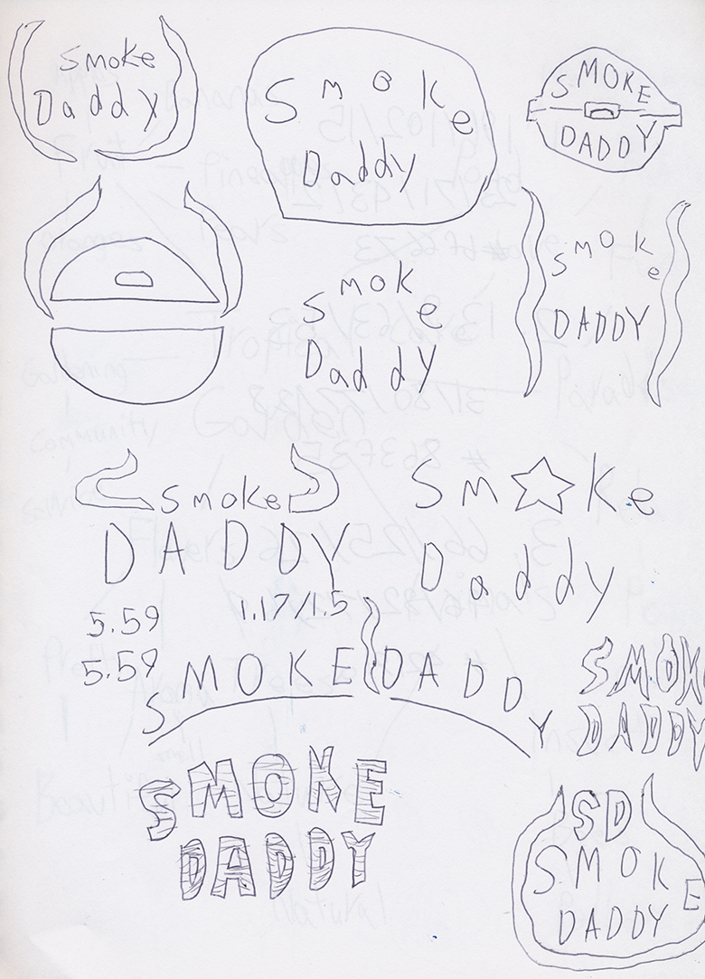
These are a few concept sketches for the Smoke Daddy logo. My overall direction with the logo is to give it a bit of a western theme. I made sure that the Smoke Daddy logo stands out on its own so it won't be simple, but makes it convincing that it's the best barbecue joint.
Brand Standards
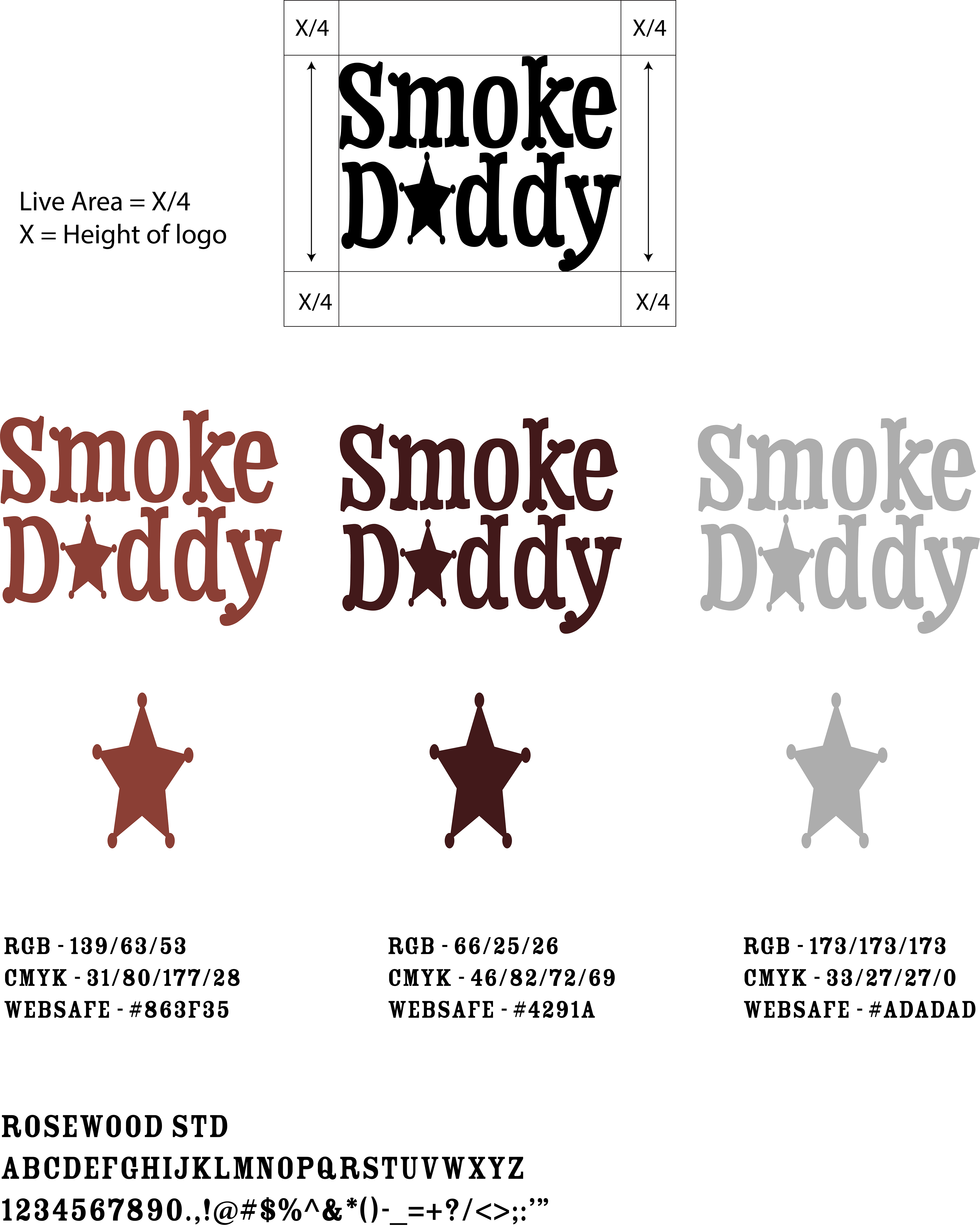
The results of the Smoke Daddy logo successfully represents "the best in town" by referencing the Sheriff's stars. The look and feeling of the logo is nostalgic-like cooking out with Dad. The primary font for Smoke Daddy is Rosewood Std because it represents "the best in town" by referencing the Sheriff's star. The alternate colors that are used for Smoke Daddy represents the meat color along with the primary color for smoke. This references the types of smoke that multiple restaurants use for cooking.
Website
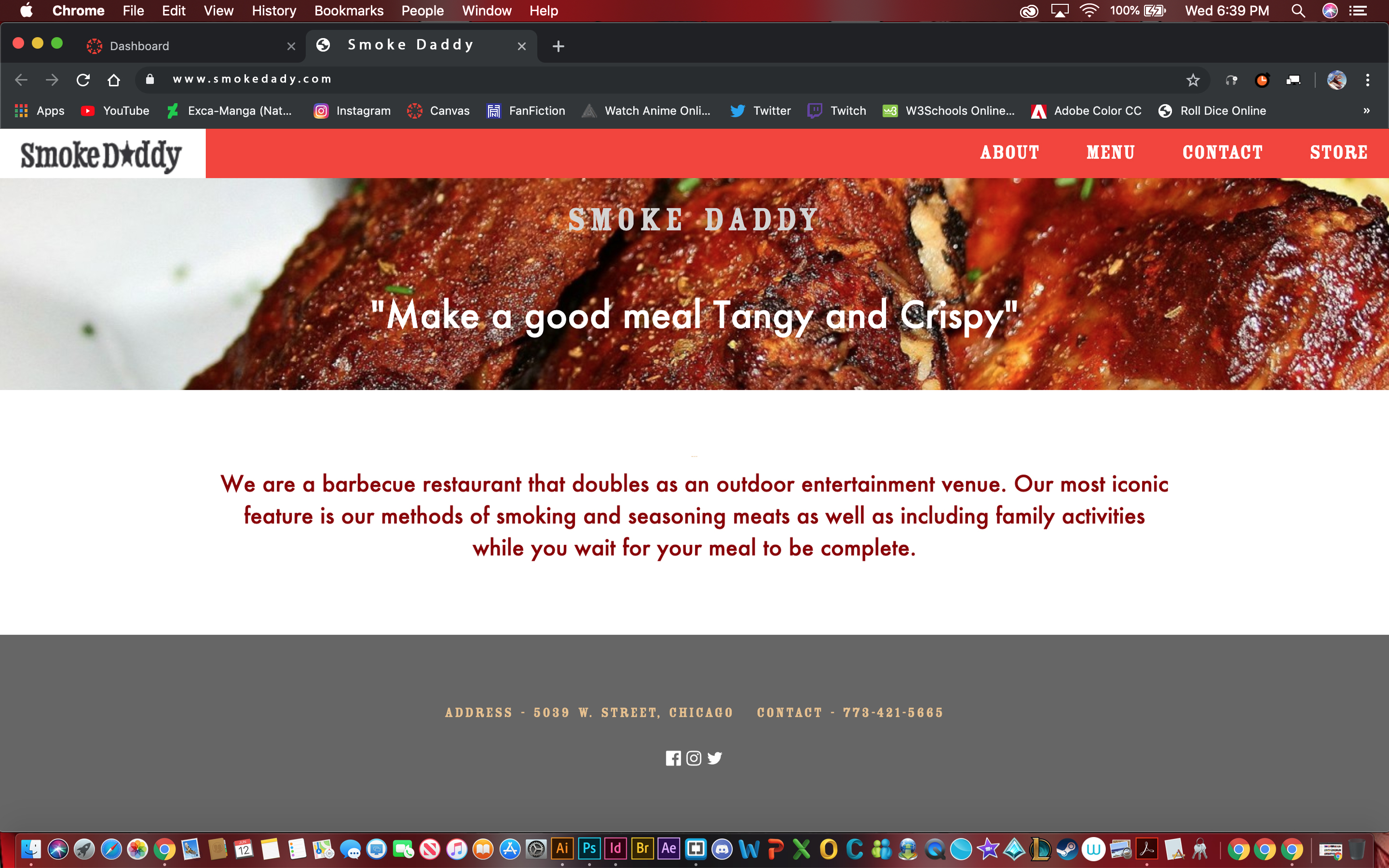
Out of the main projects I've done, Smoke Daddy was such a strong concept, that I got a personal attachement to and it lead to the creation of the website. I created a minimal site to tell their story and put the menu out there along with selling unique brands and Smoke Daddy's BBQ Saue in smoke flavor.